Learn Python Through Cricket Statistics
SkillVeris Team
Content Team
Learning data science through a subject you care about is far more effective than generic tutorials, and cricket data teaches all four core skills at once.
In this guide, you'll learn:
- An IPL ball-by-ball dataset gives you tens of thousands of structured rows that are perfect for practising pandas and visualisation.
- The first step with any dataset is checking shape, types, sample rows, and null counts to surface quality issues early.
- The groupby, aggregate, sort, and visualise pattern answers roughly 80% of real data analysis questions.
- Qualification thresholds keep performance rankings honest by filtering out small, noisy samples.
1Why Cricket Is Perfect for Learning Data Science
Cricket is one of the most statistically rich sports in the world. Every ball generates data: runs scored, wicket type, bowling speed, and fielding position.
An IPL season produces tens of thousands of rows of structured data — perfect for learning pandas, groupby, filtering, and visualisation in a context that feels meaningful rather than contrived.
By the end of this project you'll have answered real cricket questions using code, and learned the core data analysis skills that transfer directly to business analytics, machine learning, and data science roles.
2The Dataset
We'll use a ball-by-ball IPL dataset available free on Kaggle (search "IPL ball by ball"). Each row represents one delivery and includes columns such as the following:
- match_id — Unique match identifier
- inning — 1st or 2nd innings
- batting_team — Team currently batting
- bowling_team — Team currently bowling
- over — Over number (0-indexed)
- ball — Ball within the over
- batsman — Batsman's name
- bowler — Bowler's name
- total_runs — Runs from this delivery
- batsman_runs — Runs credited to batsman
- is_wicket — 1 if a wicket fell, 0 otherwise
3Loading and Exploring the Data
This is always step one with any new dataset: shape, types, sample rows, and null counts. These four calls reveal 90% of data quality issues before you start any analysis.
💡Pro Tip
Use df.describe() for numerical columns to see min, max, mean, and percentiles at a glance. For categorical columns, df["batsman"].nunique() tells you how many unique players appear in the data.
Initial Inspection
Load the data and run a quick first look before touching any analysis.
import pandas as pd
import matplotlib.pyplot as plt

# Load the dataset
df = pd.read_csv("ipl_ball_by_ball.csv")

# First look
print(df.shape)          # (number of rows, columns)
print(df.dtypes)         # column types
print(df.head(3))        # first 3 rows
print(df.isnull().sum()) # missing values per column4Top Run Scorers
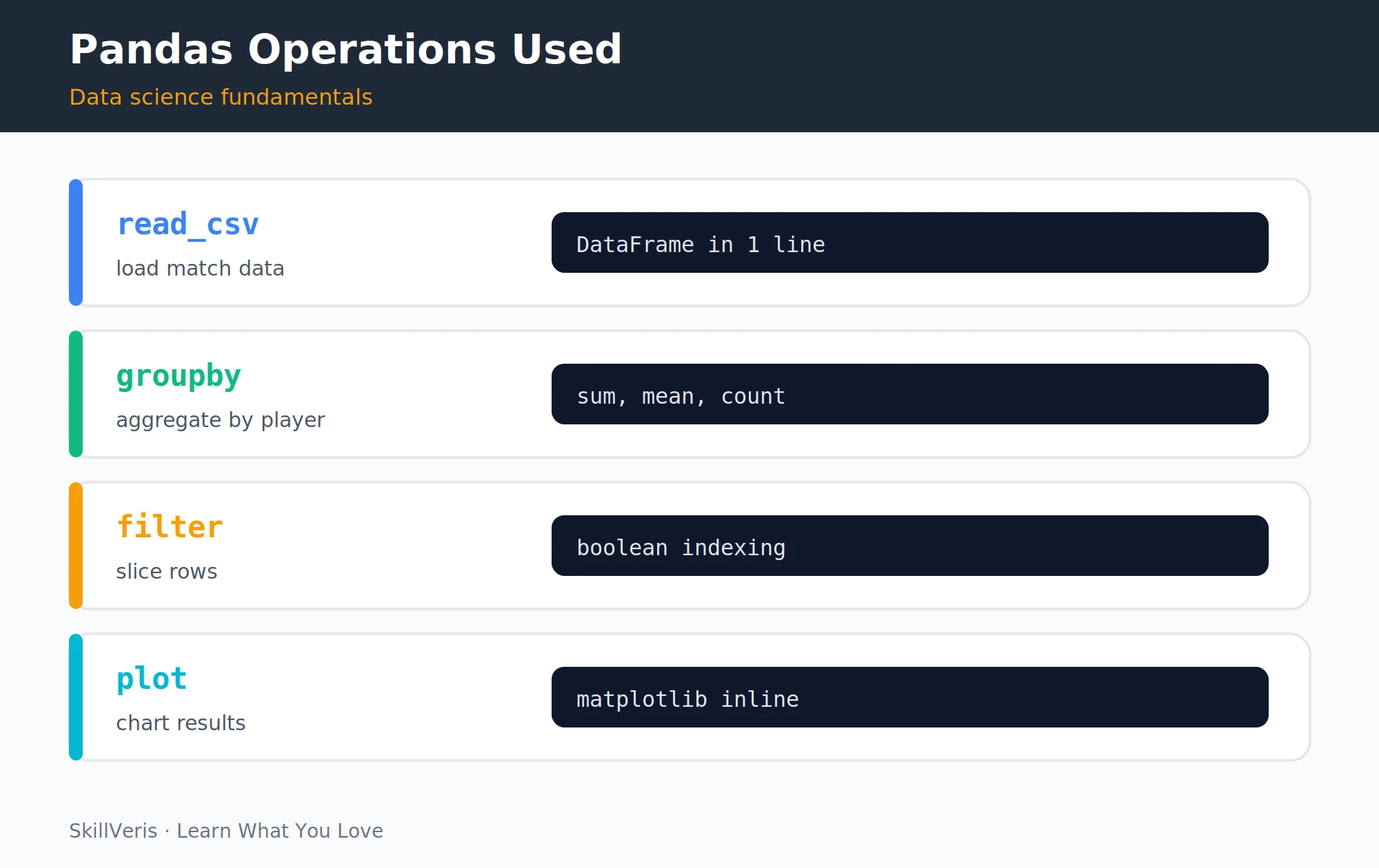
The four pandas operations — read_csv, groupby, filter, and plot — power almost all cricket analysis.
The three operations groupby, sum, and sort_values are the foundation of nearly every aggregation in data analysis. Master this pattern and you can answer most "who did the most X" questions in any dataset.
Total Runs per Batsman
Group by batsman, sum their runs, sort descending, and take the top ten.
# Total runs per batsman
top_scorers = (df.groupby("batsman")["batsman_runs"]
               .sum()
               .sort_values(ascending=False)
               .head(10))
print(top_scorers)
print(f"Top scorer: {top_scorers.index[0]} with {top_scorers.iloc[0]} runs")5Best Strike Rates
Strike rate = (runs scored / balls faced) × 100. We need two aggregations and then combine them.
The filter balls_faced >= 200 is a qualification threshold — excluding batsmen with too few balls prevents someone who faced 5 balls and hit 3 sixes from topping the list. Always apply qualification thresholds in performance rankings.
Calculating Strike Rate
Count balls faced, sum runs scored, then combine and apply the threshold.
# Balls faced = count of deliveries (excluding wides)
balls_faced = (df[df["wide_runs"] == 0]
               .groupby("batsman")["ball"]
               .count())
runs_scored = df.groupby("batsman")["batsman_runs"].sum()

# Calculate strike rate, filter batsmen with 200+ balls
sr = (runs_scored / balls_faced * 100).dropna()
sr_qualified = sr[balls_faced >= 200].sort_values(ascending=False)
print("Best strike rates (min 200 balls):")
print(sr_qualified.head(10).round(2))6Top Wicket Takers
Notice the compound boolean filter: (condition1) & (condition2). Each condition is wrapped in parentheses because of Python's operator precedence.
This pattern — filter then aggregate — is the most common data analysis pattern you'll use.
Wickets per Bowler
Filter out run-outs, which are credited to the fielder rather than the bowler, then count wickets per bowler.
# Filter out run-outs (credited to fielder, not bowler)
bowler_wickets = (df[(df["is_wicket"] == 1) &
                     (df["dismissal_kind"] != "run out")]
                  .groupby("bowler")["is_wicket"]
                  .sum()
                  .sort_values(ascending=False))
print("Top wicket takers:")
print(bowler_wickets.head(10))7Economy Rates by Bowler
Economy rate is runs conceded per over (6 balls), and lower is better for the bowler. We compute overs from balls bowled, then apply a minimum-overs qualification.
Most Economical Bowlers
Sum runs conceded, derive overs from ball counts, and qualify by a minimum of 10 overs.
# Runs per over = total runs conceded / overs bowled
runs_conceded = df.groupby("bowler")["total_runs"].sum()
balls_bowled = df.groupby("bowler")["ball"].count()
overs_bowled = balls_bowled / 6
economy = (runs_conceded / overs_bowled).dropna()

# Qualify: minimum 10 overs
eco_qualified = economy[overs_bowled >= 10].sort_values()
print("Most economical bowlers (min 10 overs):")
print(eco_qualified.head(10).round(2))8Run Rate by Over (Powerplay vs Death)
This analysis confirms what every cricket fan knows: powerplay and death overs are higher-scoring than the middle overs. Seeing it emerge from raw data is the moment data analysis clicks.
Average Runs per Over
Group by over, take the mean, re-index to 1-based overs, and compare the powerplay against the death overs.
# Average runs per over across all matches
runs_per_over = (df.groupby("over")["total_runs"]
                 .mean()
                 .reset_index())
runs_per_over.columns = ["over", "avg_runs"]
runs_per_over["over"] = runs_per_over["over"] + 1  # 1-indexed
print(runs_per_over)
print(f"Powerplay avg (1-6): {runs_per_over[:6]['avg_runs'].mean():.2f} runs/ball")
print(f"Death overs avg (16-20): {runs_per_over[15:]['avg_runs'].mean():.2f} runs/ball")9Toss Decision and Match Results
If the win rate is close to 50%, the toss is essentially a coin flip. The data often surprises even seasoned fans — that's the power of checking assumptions against evidence.
Toss vs Win Rate
Load the match-level file, flag whether the toss winner won the match, then break it down by toss decision.
# Load match-level file (has toss_decision and winner columns)
matches = pd.read_csv("ipl_matches.csv")

# Did teams that won the toss win the match?
matches["toss_won_match"] = matches["toss_winner"] == matches["winner"]
toss_win_rate = matches["toss_won_match"].mean() * 100
print(f"Win rate after winning toss: {toss_win_rate:.1f}%")

# Breakdown: bat first vs field first
toss_breakdown = matches.groupby("toss_decision")["toss_won_match"].mean() * 100
print(toss_breakdown.round(1))10Visualising with Matplotlib
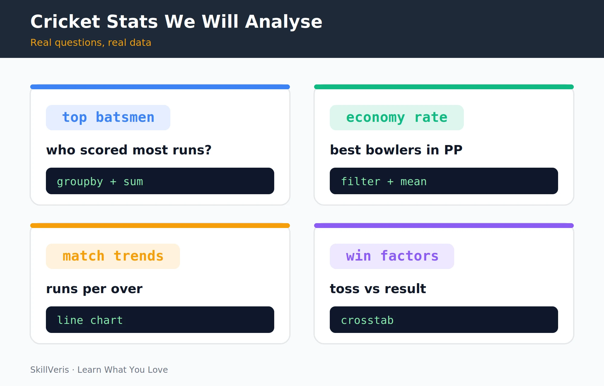
Top batsmen, economy rates, match trends, and toss-versus-result are four cricket questions that each teach a core data analysis technique.
A side-by-side bar chart and line chart turn the aggregations above into a shareable dashboard image.
Building the Dashboard
Plot the top scorers as a horizontal bar chart and the run rate by over as a line chart, then save the figure.
import matplotlib.pyplot as plt

fig, axes = plt.subplots(1, 2, figsize=(14, 5))

# Bar chart: top 10 run scorers
axes[0].barh(top_scorers.index[::-1], top_scorers.values[::-1], color="#f59e0b")
axes[0].set_title("Top 10 Run Scorers", fontsize=14, fontweight="bold")
axes[0].set_xlabel("Total Runs")

# Line chart: run rate by over
axes[1].plot(runs_per_over["over"], runs_per_over["avg_runs"],
             color="#3b82f6", linewidth=2, marker="o", markersize=4)
axes[1].axvspan(1, 6, alpha=0.1, color="green", label="Powerplay")
axes[1].axvspan(16, 20, alpha=0.1, color="red", label="Death overs")
axes[1].set_title("Average Runs per Over", fontsize=14, fontweight="bold")
axes[1].set_xlabel("Over"); axes[1].set_ylabel("Avg runs per ball")
axes[1].legend()

plt.tight_layout()
plt.savefig("cricket_dashboard.png", dpi=150, bbox_inches="tight")
plt.show()11Extending the Project
Once you have the basics working, these extensions deepen your skills significantly:
- Head-to-head analysis: how does Batsman A perform against Bowler B? Use a double groupby.
- Venue analysis: which grounds favour batsmen vs bowlers? Join with the matches file.
- Season-by-season trends: has the average scoring rate increased over the years? Time-series analysis with Seaborn.
- Streamlit dashboard: turn your analysis into a shareable web app (see our Streamlit project guide).
12Key Takeaways
A few principles carry over from this project to any data analysis work you do next.
- Real, interesting data (cricket, music, gaming) teaches data analysis skills faster than synthetic tutorials.
- The core pattern groupby → aggregate → sort → visualise covers 80% of data analysis questions.
- Always apply qualification thresholds in performance rankings to avoid noise from small samples.
- Check assumptions against data — cricket "common knowledge" is often wrong when you actually look at the numbers.
13What to Learn Next
Continue learning through cricket with these follow-on resources:
- Build a Data Dashboard with Streamlit — make your cricket analysis interactive.
- Data Analytics Roadmap — the full learning path this project is part of.
- Statistics for Data Science — the maths behind your cricket metrics.
14Frequently Asked Questions
Q: Where can I get real IPL data?
A: Kaggle (kaggle.com) has several IPL ball-by-ball datasets under open licences, updated each season. Search "IPL ball by ball" or "Cricsheet". CricSheet.org also provides free ball-by-ball data in YAML format for international and franchise cricket.
Q: Do I need to know pandas before this project?
A: Basic pandas helps but isn't required. The project introduces each operation in context. If you get stuck, our Pandas for Beginners guide covers every function used here in detail.
Q: Can I do this analysis for other sports?
A: Absolutely. The same groupby-aggregate-visualise pattern works for football (goals per team), basketball (points per player), Formula 1 (lap times per driver), or any sport with ball-by-ball or event-level data. The data column names change; the pandas logic stays the same.
Q: How accurate are these results compared to official statistics?
A: Community datasets may exclude some matches or have minor errors. For precise statistics matching official records, cross-check with ESPNcricinfo or the official IPL website. For learning purposes, minor discrepancies don't matter — the techniques are identical.
Related Reading
Get The Print Version
Download a PDF of this article for offline reading.
About the Publisher
SkillVeris Team
Content Team
We believe the best way to learn tech is through what you already love — sports, music, photography, and more.
View all postsRelated Posts
Never miss an update
Get the latest tutorials and guides delivered to your inbox.
No spam. Unsubscribe anytime.